


Description
Modern Cardboard Coffee Cartons For Brand Order
Cardboard coffee packaging boxes help roasteries present roast beans, flavoured blends, and café items with a steady structure and consistent shelf arrangement. Cardboard Liquor Gift Boxes are sometimes referenced when brands want a coordinated packaging family across beverages and gourmet categories without changing the overall visual system. This kind of alignment helps ranges stay organised in retail, gifting, and subscription assortments, especially when multiple product teams share the same display spaces.
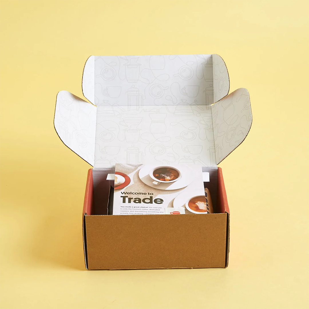
A coffee carton holds its shape in storage, supports inner freshness bags, and provides panels that remain readable during daily handling. Clean folds and straight edges improve barcode scanning and keep product information easy to read. This makes the carton a practical part of range consistency rather than only an outer cover. For small cafés and larger roasteries, the focus is on stability, clarity, and repeatable results across batches.
Shelf-Ready Layout That Keeps Blends Easy To Find
Consistent footprints allow roasters to build a clear layout system for espresso, filter, decaf, and seasonal options. When customers browse shelves or online grids, predictable panel structure and stable box geometry help them identify variants more easily. The layout stays planned, reducing confusion that can occur when multiple formats compete.
This approach supports photography and digital listings where front faces need to remain clean and aligned across products. Once the structural framework is stable, design teams can adjust colour bands, origin cues, and tasting notes without redesigning the entire pack. The carton supports range ordering while keeping the coffee details the focus. Over time, this builds familiarity that supports repeat ordering.
Key Points Brands Notice Early
- Shared footprints that keep multi-blend lines consistent
- Flat faces that protect readability and scanning
- Stable bases that maintain tidy shelf presentation
- Panel space that supports clear roast and brewing cues
Practical Uses Across Coffee Programs
- Retail shelf-ready cartons for core blends
- Subscription assortments with aligned artwork
- Café counter packs for daily rotation
- Curated gift selections with mixed items
| Feature Focus | Description For Coffee Range Order | Material Options | Surface Finish Choices | Extra Elements | Typical Usage |
|---|---|---|---|---|---|
| Range Consistency | Predictable shapes across weight and blend families | Kraft, SBS, recycled blends | Matte, gloss, soft-touch | Icon grids, colour bands | Retail and online lines |
| Information Clarity | Clear hierarchy for roast, origin, and brew notes | Smooth kraft, white board | Light anti-scuff layers | Date code zones | Grocery and cafés |
| Shelf Stability | Upright posture and reliable stacking behaviour | Thicker board options | Soft matter for handling | Locking tabs | High-traffic displays |
Carton Structure That Supports Aroma And Pouch Fit
Coffee quality is sensitive to light, moisture, and air, so outer cartons work best as a supportive layer that protects the inner freshness system during storage and transit. Food Related Cardboard Boxes are often considered alongside coffee cartons when roasteries plan packaging that will share gift sets with snacks, syrups, or gourmet pantry items. This helps keep sizes compatible and reduces the need for mixed formats across seasonal collections.
A correctly sized carton holds the valve bag or pouch in position, limits scuffing, and absorbs minor impacts that can soften corners. When internal space is balanced, the pouch sits without tight compression and the outer shape stays stable under stacking loads. This helps protect presentation and keeps the cartons looking consistent when they move through retail and fulfilment workflows.
Sizing Choices That Reduce Movement And Corner Stress
Two common risks are cartons that are too tight, which can press the pouch, and cartons that are too loose, which can allow shifting. A controlled fit reduces both issues while keeping panels flat and edges straight. This helps roast details, labels, and brewing guidance remain readable after repeated handling. It also simplifies packing because staff can rely on a consistent fit rather than adjusting by guesswork.
Outer structure and inner freshness systems are designed to work together. The bag manages freshness control, while the carton supports protection, organisation, and clear identification. When these roles are balanced, the experience stays consistent from shelf display to home storage. Small depth or board adjustments can refine performance without changing the established range layout.
What A Balanced Fit Usually Achieves
- Reduced corner dents during stacking
- Less pouch movement in transit
- Cleaner panel faces for labels and barcodes
- More consistent appearance across batches
Simple Packing Flow Many Teams Use
- Measure pouch height, width, and valve position
- Select a depth that supports the natural pouch shape
- Insert with consistent facing direction
- Close along pre-creased folds with even corners
- Case-pack with aligned outer faces for easy checks
| Feature Focus | Description For Aroma Support And Fit | Material Options | Surface Finish Choices | Extra Elements | Typical Usage |
|---|---|---|---|---|---|
| Fit Accuracy | Balanced internal space for stable pouch seating | Kraft, coated SBS | Matte, soft-touch | Inner sleeves | Blend cartons |
| Transit Resilience | Outer shape holds under realistic stacking loads | Recycled board mixes | Rub-resistant coatings | Reinforced corners | Regional distribution |
| Retail Order | Flat faces keep hierarchy readable | Smooth kraft, white board | Light gloss options | Barcode panels | Grocery aisles |
Wholesale Coffee Box Ranges For Growing Roasteries
As coffee businesses scale, packaging usually shifts from ad hoc sizes to a structured system that can carry multiple weights, blends, and routes to market. Shop Cardboard Boxes is commonly referenced when roasteries want familiar size logic that supports repeat ordering and predictable shelf geometry. This kind of structure helps reduce overlap across SKUs and keeps inventory simpler when the same range is used for retail, mail-out, and gifting.
Wholesale planning supports consistency in board grades, cutting patterns, and print placement across the year. Once core footprints are defined, teams can refresh seasonal artwork without rebuilding structural rules. This approach supports smoother supplier coordination and reduces the risk of visual drift across long-term programs. The result is a range that stays recognisable while still allowing controlled design variation.
Planning A Compact Family For Multi-SKU Lines
A small set of well-chosen footprints can cover most product weights when depth and internal tolerance are planned carefully. This simplifies packing stations and reduces errors because staff learn a stable size logic rather than switching formats frequently. It also supports subscription programs where aligned outer dimensions make multi-box assortments feel consistent.
Over time, feedback from handling, storage, and customer response can guide subtle upgrades in board strength or closure style. Because the external shape stays familiar, these changes remain smooth. The range keeps continuity while improving performance. This approach supports scaling without changing the size system customers already recognise.
Common Adjustments Roasteries Request
- Depth tuning for different pouch heights
- Alternate closures for retail and mail-out lines
- Window options for selective visibility
- Reserved areas for roast dates and batch codes
Steps Used To Build A Stable Size System
- Group products by weight, grind, and sales channel
- Choose compact footprints to cover each family
- Match board strength to realistic stacking conditions
- Create shared artwork zones across sizes
- Test samples through packing and distribution
| Feature Focus | Description For Wholesale Scaling | Material Options | Surface Finish Choices | Extra Elements | Typical Usage |
|---|---|---|---|---|---|
| Size Family Logic | Few footprints that support many blends | Kraft, SBS, recycled mixes | Soft matte, balanced gloss | Icon systems | Roastery-wide lines |
| Bulk Consistency | Repeatable dielines and print alignment | Recycled + virgin blends | Anti-scuff layers | Serial coding | Seasonal programs |
| Gift Compatibility | Dimensions that pair with mixed items | Smooth kraft, premium SBS | Matte for calm branding | Window cut-outs | Curated hampers |